Why I Fix the Homepage First

Whenever I joined a new cybersecurity company as a content marketing leader, the first instinct I usually encountered from colleagues was the same: “We need to redesign the entire website, immediately!”
I understood the impulse. The site felt dated, the messaging no longer reflected how the company talked internally, and a redesign felt like forward motion. But after doing this enough times, I learned that most early-stage startup website redesigns should begin with improving the home page first and show external market proof that the messaging was working. After that, my team could use the elements of the page to redesign and improve the broader content architecture.
The following are the strategic steps I took to build award-winning home pages for cybersecurity startups.
1. I optimized the hero section
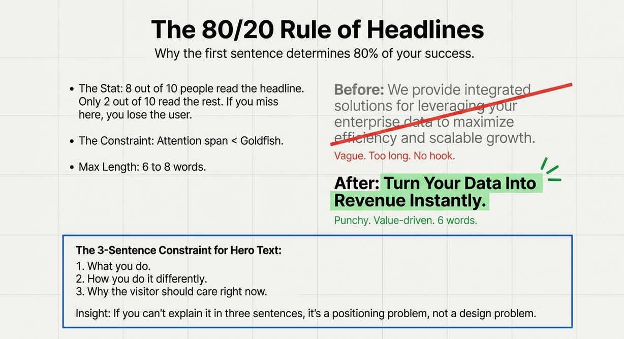
In most B2B cybersecurity companies, 50 to 70 percent of traffic lands on the homepage first and just vaporizes. Over 60% of visitors leave and don’t take any action. That drop-off was rarely driven by design quality. It was driven by confusion. Visitors left because they couldn’t immediately understand what the company did, how it did it, or why it mattered to them.
I liked to force a constraint here—three sentences, maximum. If you couldn’t explain your value in three sentences, the issue wasn’t the design. It was the positioning.
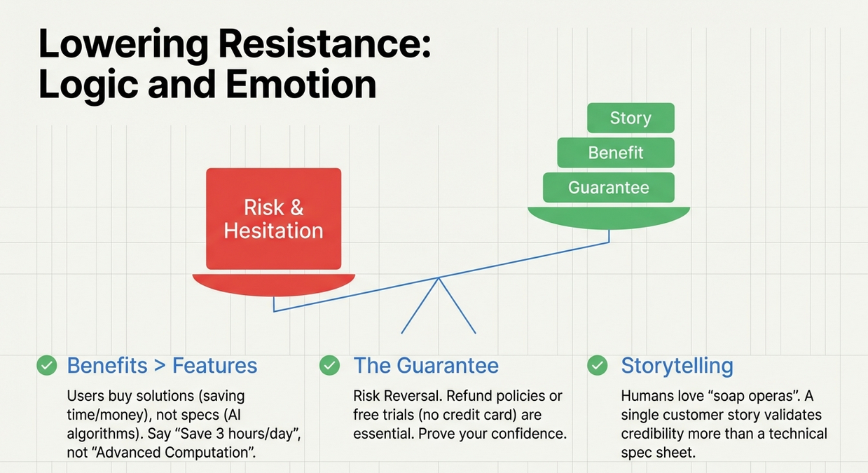
2. Then, I used customers to reduce anxiety and conversion friction
Once clarity was established, the next job of the homepage was to build trust. In cybersecurity, trust wasn’t built through feature lists or architecture diagrams. It was built by showing that real people with real problems had already seen results.
Short, specific customer stories and testimonials consistently outperformed generic claims. People connected with outcomes, not platforms, and a single believable customer story often did more to establish credibility than an entire page of features.
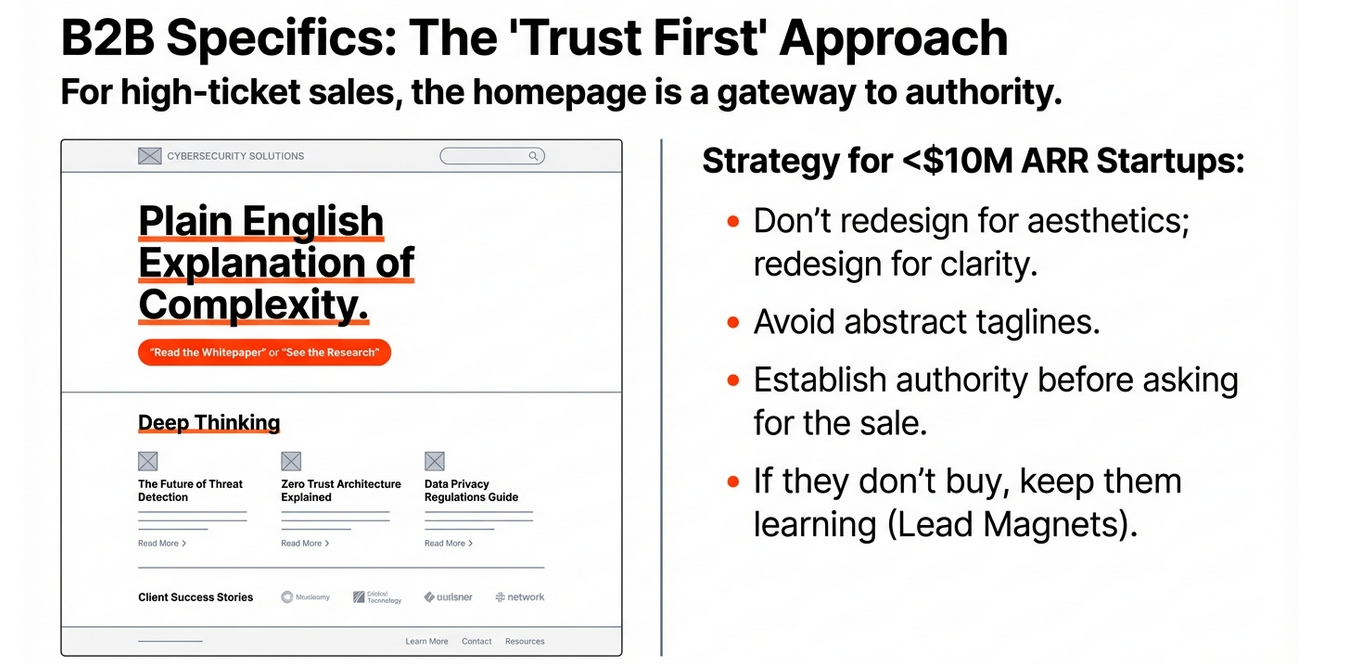
3. I then reinforced external social proof with internal deep thinking
The homepage also needed to act as a gateway to deeper thinking. Essentially, your blog. Thought leadership extended its impact far beyond the initial visit. An active, consistently updated blog signaled credibility and momentum, particularly in cybersecurity, where buyers looked for vendors who understood the broader landscape.
When a homepage surfaced original perspectives and linked naturally into a deeper content library, it kept visitors engaged and reinforced trust over time.
4. Last but not least, the product or service was featured
Product marketing on the homepage required the same level of discipline. The goal wasn’t to explain everything, but it was to explain enough. Buyers wanted a practical understanding of how the product worked at a high level and what made it different. The biggest mistake I saw was either overwhelming visitors with feature depth or saying almost nothing at all. Honest, straightforward explanations built far more trust than aspirational promises, especially for early-stage companies still iterating on the product.
Your homepage doesn’t need to explain everything—but it must explain enough.
Too many early-stage companies fall into one of two traps:
-
Overloading the page with features
-
Hiding the product behind vague promises
What Actually Converts
Buyers want to know:
-
How the product works at a high level
-
What makes it different
-
What pain it removes from their day-to-day work
Homepage Product Marketing Best Practices
-
Explain how it works, not just what it is
-
Tie features directly to real benefits
-
Use simple diagrams or step-based explanations
-
Don’t oversell—credibility beats hype
If the product is still maturing, that’s okay. Lean more heavily on previous sections I discussed above:
-
Thought leadership
-
Customer validation
-
Clear problem framing
Over-promising kills trust faster than under-selling.
This works well for cybersecurity SaaS below $10M ARR
Every homepage ultimately needed to be designed to drive two behaviors: conversion and engagement, in that order.
For early-stage companies below $10M ARR, conversion mattered most. Whether it was a free tool, a useful assessment, a high-value webinar, or a research report, there needed to be a compelling offer that gave visitors a reason to act immediately.
If they didn’t convert, the next goal was to keep them learning—not to let them leave.None of this worked without measurement. Homepage bounce rates above 50 percent were common, but they weren’t inevitable. The fastest improvements came from testing one element at a time and using behavioral data—scroll depth, clicks, session recordings—to understand where visitors hesitated or dropped off. Small, iterative changes compounded into validated messaging that actually resonated with the market.
What about the full website redesign?
A full website redesign did have a place, but only after teams had proven what worked. When companies had clear messaging, reliable conversion paths, and content that already performed, a redesign amplified results instead of guessing at them. Until then, starting small and optimizing the homepage was almost always the higher-ROI move.
The following are some measurement best practices:
-
Test one homepage element at a time
-
Track bounce rate, scroll depth, and click behavior
-
Use heatmaps and session recordings to observe friction
-
Change one variable, measure, learn, repeat
Over time, small optimizations create something far more valuable than a redesign: validated messaging that actually converts.
For early-stage cybersecurity companies, the website wasn’t a brand statement—it was a growth lever. The teams that won started with clarity, focused on trust and conversion, and let data guide decisions. A beautiful website that didn’t convert wasn’t a competitive advantage. It was just expensive wallpaper.